Riverland
Health Foods
Brand Design | Website Design | 2024
Rebrand and refresh for a health food business in Berri, Riverland.

THE BRIEF:
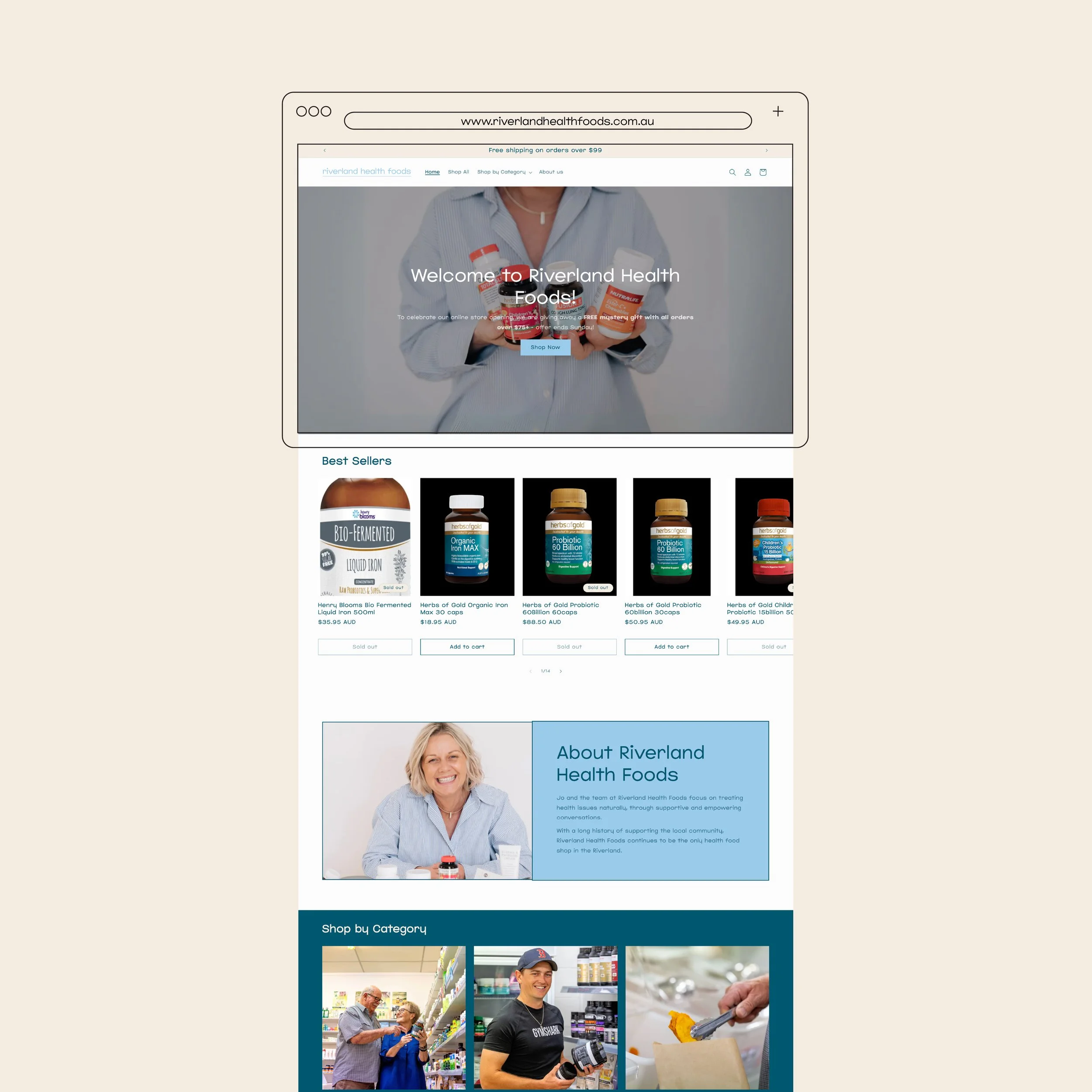
To create an inviting and user-friendly website that reflects their commitment to growth, both in-store and online.
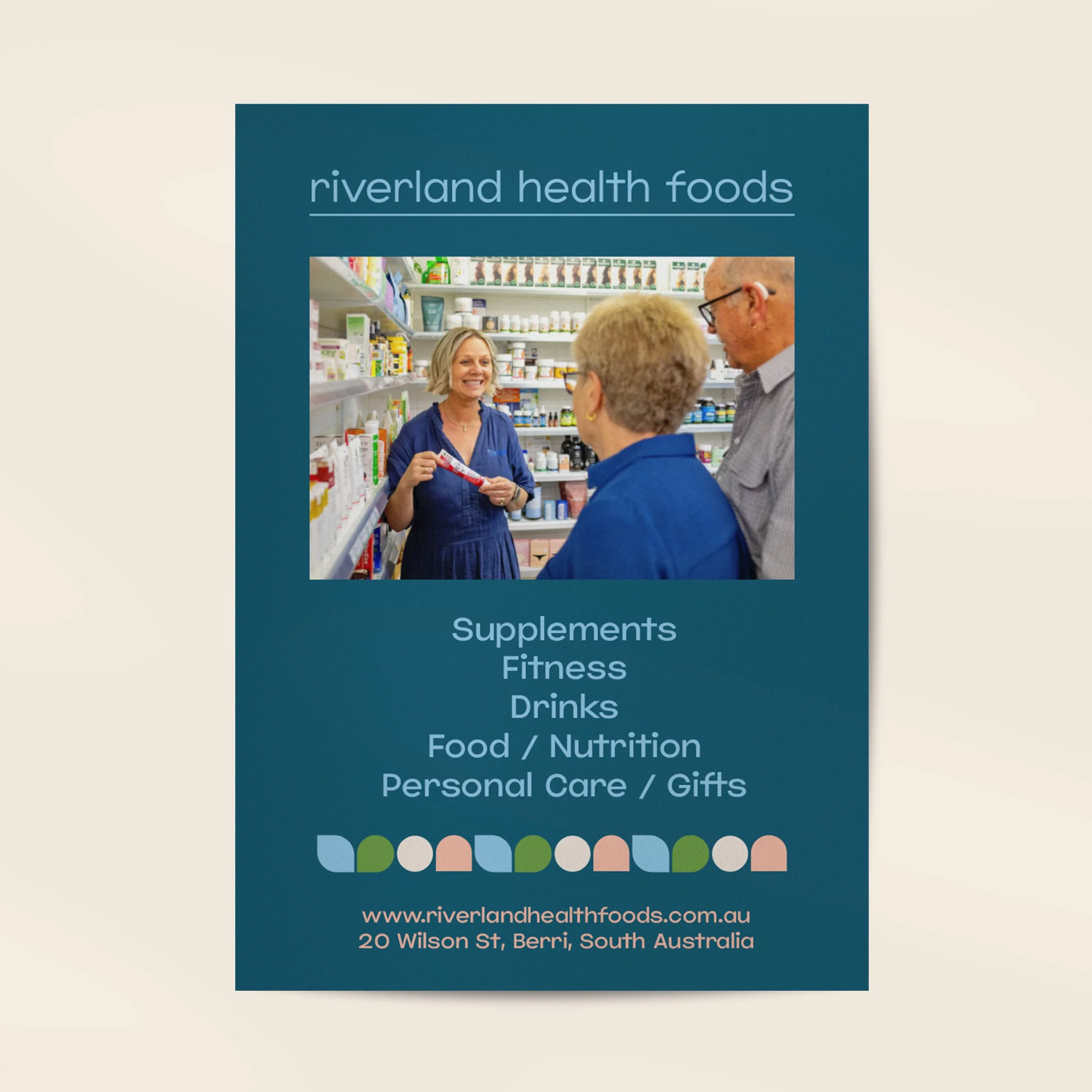
Introducing you the new brand of Riverland Health Foods, a modern and fresh take on the old brand. The colours are stunning, the logo is super simple, and the brand has come together so well.
RHF focuses on treating health issues naturally, through conversations and natural solutions. They stand to help clients take control of their own health by taking best action to understand their own body. Located in Berri, they offer supplements, fitness goods, drinks, food and nutrition and gifts.
Turning this into a brand, we focussed on creating a friendly, kind, professional and relatable vibe, while valuing wellness, education, guidance and creating a positive impact in the community - which I believe we achieved really well! A simple logo suite meant more effort could go into determining colours which stood out but assisted in the brand experience. Next stop is new signage and we'll be looking fresh!


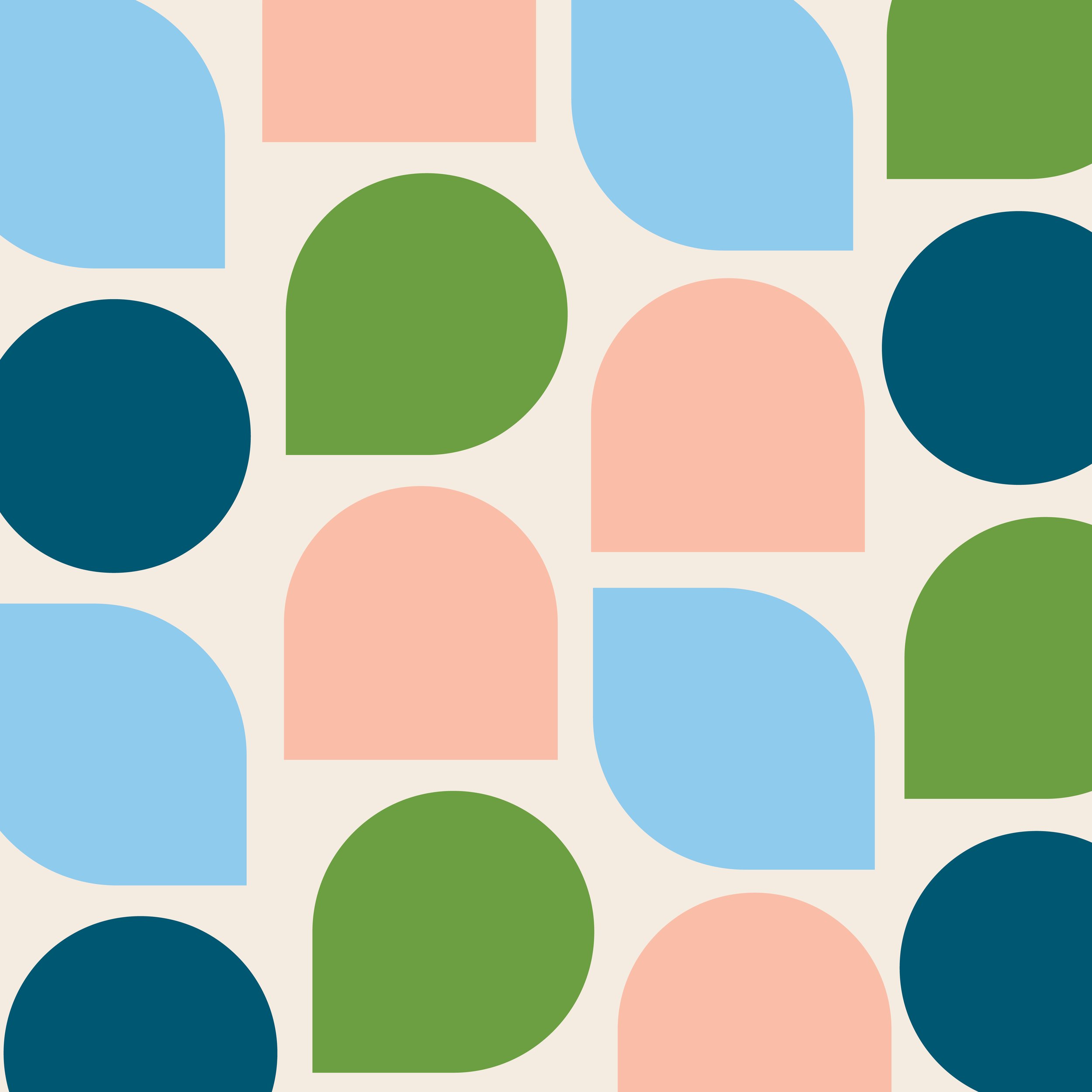
Breaking down the primary logo, the typeface is on that supports a kind and empathetic vibe, with the characters being more rounded and slightly wider than normal.
The line underneath helps play into the use of shapes across the brand, and gives more of an emphasis to the type, anchoring it to an object.
Intentionally minimal, the logo as a whole is comprised of just two elements, giving a greater emphasis to the many aspects of the business. This means other elements will help to lift the brand.